In the age of digital downloads and music streaming, it could be argued that the album cover is increasingly losing significance. Let’s face it, not many people spend time poring over accompanying JPEGs the way they once did with album sleeves and liner notes. Which might partially explain one old trend that seemed to be on the increase this year: the ‘anonymous’ cover.

Arctic Monkeys, Arcade Fire and Paul McCartney (above) all declined to put their names on their album covers this year in favour of minimal and/or abstract artwork (although there is a subtle ‘AM’ on the former, below).

While this is hardly a new idea, it used to be more commonly reserved for more obscure acts, for whom enigmatic statements only added to their underground appeal (still the case for plenty of acts this year, such as
Dean Blunt,
Steve Hauschildt and Fort Romeau (below)). The trend for headline acts to do likewise, however, says something rather different. Namely, it’s a statement that they’ve reached a level of notoriety where they don’t even need to have their name on the cover, much like they don’t need to have their names on any guestlist in the world, ever, to stroll in (although it should be noted that in record shops, the names often do appear on removable stickers. I’m not sure whether that’s also the case in real life).

Kanye West took the concept even further. His may not be a name that screams low-key minimalism, but his
Yeezus album was almost completely free of artwork, the CD arriving in nothing but a plain jewel case sealed by a bit of red tape (a design that got
even starker as it developed). Some suggested this was symbolic of the album’s stripped-back style in comparison to the sprawling bombast of
My Beautiful Dark Twisted Fantasy, but it also ties in with Kanye’s
“no strategy” promotional campaign: “This whole process is about giving no fucks at all,” he explained. “I’ve got an idea on how to sell more music – it’s called make better music”.
The idea was clearly to let the music speak for itself, and that anything else, including artwork, was a distraction. Seeing as Yeezus has popped up in virtually every Best of 2013 list going (even in avant garde music bible The Wire), it’s fair to say that the critics at least were listening. However, judging by the album’s relatively poor sales and the way Kanye’s self-promotion machine has kicked into top gear since, the “no strategy” strategy may have been about as logical an idea as it initially sounded.

On the other hand, perhaps
Yeezus was simply another example of simplified design slowly making inroads into hip-hop. Whereas once rap covers tended to be brash and garish (sometimes, like in
this classic by Big Bear, to a ludicrous degree), this year quirkier, psychedelic efforts from Chance the Rapper (above) and Tyler, The Creator (below) caught the eye, while
this cover for Pusha T’s excellent
My Name is My Name LP rivalled even Kanye’s for minimalism (funnily enough, it was actually produced by West’s DONDA creative agency).

However, even DONDA’s work was perhaps overshadowed by the year’s most striking and divisive artwork, which appeared on David Bowie’s ‘The Next Day’ album. With the iconic cover of his ‘Heroes’ LP partially blanked out by a stark white square, and the original title crossed out, it both referenced and re-appropriated Bowie’s past, a subversion which suggested an attempt to delete his legacy while accepting that doing so would never be possible. Smart stuff, although it has to be said that, in some ways, the concept was stronger than either the actual artwork or the music itself…

Still, while all these covers may be interesting, they were neither the best nor worst we saw this year. Those honours go to the following efforts. Starting with the worst ones, ‘cos that’s more fun…
The Ten Worst Album Covers of 2013
White Hills – So You Are… So You’ll Be
We love reliably righteous space-rockers White Hills, but seriously, what the hell is this? Shit photo, queasy colour and an awful font. It looks like an
X Files fan’s amateurish attempt to recreate a binned shot from the opening credits.
When Saints Go Machine – Infinity Pool 
There’s nothing like picking up a promo CD only to find no obvious information about who the hell it actually is. Although then again, it’s no surprise that anyone even distantly involved with the creation of this putrid cover would prefer to remain anonymous.
The Field – Cupid’s Head
While the fact that every album by The Field had up till now come with a basically identical (and incredibly dull) cover was tedious, the one thing you could say about them was they were extremely identifiable. So what does he do for his new one? Darkens the background to the point where it’s barely legible. Yeah, good one.
Miley Cyrus – Bangerz 
We can almost forgive Miley Cyrus for essentially turning herself into human clickbait during the cynical cultural horrorshow that has exploded around her in 2013. But we cannot forgive this hideous, faux-eighties atrocity of an album cover. A design so bad it could’ve been knocked out by an embryo with a copy of photoshop, the horror was quadrupled when it was released with four alternative covers. In case you needed to learn four new ways to vomit.
My Bloody Valentine – MBV
If Miley’s effort was created by a tech-savvy embryo, this My Bloody Valentine cover was presumably put together by a two-headed sperm with a broken copy of MS Paint. The inordinate length of time between 1991’s
Loveless and this year’s follow-up effectively means someone could’ve spent 22 years coming up with this. And yet it appears they decided 22 seconds was enough.
Lil B – Pink Flame
The most amazing thing about this one isn’t how bad it is, but that compared to every other Lil B album cover it’s actually pretty good. On the one hand it almost makes your eyeballs invert in disbelief at how bizarrely horrible it is, on the other hand it’s so ridiculous it’s almost kind of brilliant. Some poor berk even got a
tattoo of it for Christ’s sake. So we have to include it somewhere. And let’s be honest, it’s not going in the ‘best of’ list.
Limp Bizkit – Ready To Go
This one manages to acheive something even more impressive; it’s actually
worse than every other Limp Bizkit album cover. We’d actually forgotten that Limp Bizkit put an album out this year. It’s fair to say this monstrous memory jog was not appreciated. Burn it. Burn them all.
Anna Calvi – One Breath
Someone took a moving collection of music by a hugely talented artist whose last album had a great cover…and decided to make it look like a fucking Texas album. Idiots.
Action Bronson – Saaab Stories
A bit of casual misogyny on an Action Bronson record maybe shouldn’t be a huge surprise, but at least last year’s
Rare Chandeliers mixtape contained wizards, midgets and an alligator with a gun strapped to its head. Whereas this… what the fuck is actually going on here? Even he can’t help looking a little shamefaced at being responsible for this heinous shite. Speaking of which… two bog rolls? I know he’s a large man, but is that really necessary? Actually… don’t really want to know.
Yeah Yeah Yeahs – Mosquito
Ah yes, an old favourite to round things off.
Back in April we described this as “the most atrociously lurid cover of all time”. Looking back, that was perhaps a little kind. This is truly a masterpiece of ghastliness. We doff our caps.
Right, onto the good stuff…
The Twenty Best Album Covers of 2013Holden – The Inheritors
If this list were in any particular order, this would probably be at the top anyway. Jack Featherstone’s beautiful artwork is twinned with an equally exotic font, providing the perfect accompaniment to an album that also feels like it stems from some ancient language.
Braids – Flourish // Perish
Another curious, striking black and white image. Well, that or they were just ripping off The Prisoner. Either way, we’re happy.
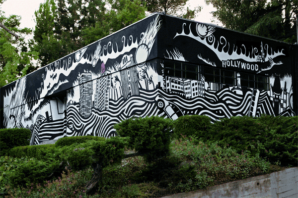
Atoms For Peace – Amok
Stanley Donwood once again came to Thom Yorke’s aid to produce this apocalyptic vision of Los Angeles ( aconcept he explains in very sweary fashion
here), which also ended up being brought to life on the walls of record label XL’s L.A. office:
 Primitive Arts – Problems
What it has to do with the music we don’t know, but there’s no way that a pencil drawing of Cristiano Ronaldo weeping isn’t going in our list. John Terry next, please.
Implodes – Recurring Dream
As we noted in
our review, this cover is almost like a real life version of the Bad Dream House from that old
Simpsons Treehouse of Horror episode. The band already exhibited a predilection for creepy imagery on their preceding
Black Earth album, but the light and colour here is miles better.
Wampire – Wampire
Talking of colour, Wampire’s debut album is absolutely saturated in it, resulting in what looks like a Victorian painted postcard sent from the outer rings of Saturn. Cosmic.
Trentemøller – Lost
So what the hell is going on here? We haven’t got a bloody clue, and apparently that’s the way Anders Trentemøller likes it. “The effect [of the cover] will hopefully be that people come up with their own stories and use their imaginations,”
he reckons. “Somehow that fits quite well with the feel on the album, that it also has a bit of a dark feeling on it”. Fair enough. We just know it’s bizarrely brilliant.
Hey Colossus – Cuckoo Live Life Like Cuckoo
Contributor Chris Sparrow chose this one, and it’s not hard to see why. In his words: “Fantastically detailed psychedelic drawing accompanying one of the best albums of the year. As if H.P Lovecraft and David Lynch dreamt up the concept for David Attenborough’s
Life on Earth“.
Dosh – Milk Money
Dosh’s
Milk Money is one of the multi-instrumentalist’s
best records yet, and the cover gives a nod to how he approached the album. Usually preferring to rope in a string of collaborators, this time Dosh decided he wanted to do everything himself, a concept emphasised by the perfectly positioned spotlights that spear out of the darkness at him.
Drenge – Drenge
Everyone was pretty surprised when Labour MP Tom Watson used a
resignation letter sent to Ed Milliband to simultaneously extol the virtues of Derbyshire duo Drenge. Yet having seen the cover to their debut album, it now all makes sense – clearly it’s a comment on how the Coalition government has been responsible for the death of both industry and ACTUAL PEOPLE during its current term. Possibly. Anyway, a great photo.
Future of the Left – How to Stop Your Brain in an Accident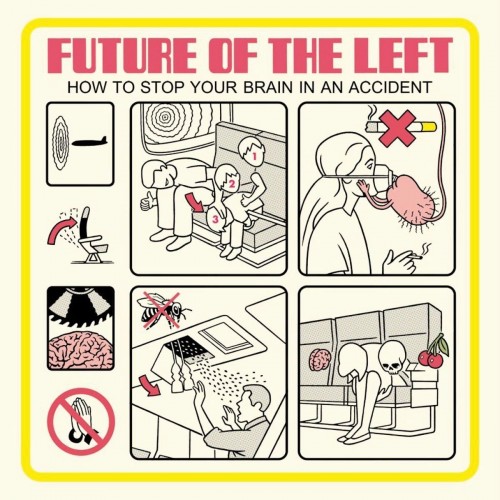
We were gutted when
The Stool Pigeon closed earlier this year, and one of the many reasons why was it also meant we had to go without our regular fix of
Krent Able‘s vivid, frequently obscene comics. So it was with great pleasure that we discovered he was doing the artwork for the equally hilarious and uncompromising Future of the Left. This bizarre take on aeroplane safety cards, complete with oddly amorous descended testicle creature, did not disappoint.
Clark – Feast / Beast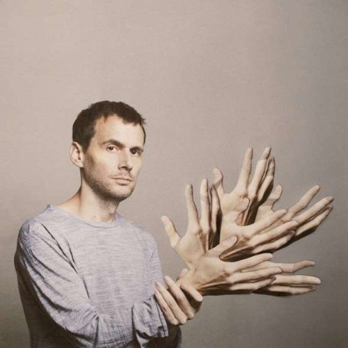
Warp stalwart Clark’s remixes album also saw the man himself being visually remixed on the cover by the photographer Alma Haser. “I saw her work and instantly found it compelling,”
said Clark. “I couldn’t peel my eyes off of it. I love the idea of exploding hands and eyes that spread out in macabre yet meticulous detail you can almost touch. Music has always been a tactile thing for me – fleshy, substantial. Alma’s work perfectly matches that aesthetic.”
No Age – An Object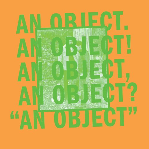
A strong post-punk feel to both the title and artwork to the latest record from California’s No Age, and the production process had a similarly do-it-yourself feel, bringing to mind stories of Joy Division sticking together copies of Factory Records’
The Return of the Durutti Column. “We physically made everything, cut everything, printed everything, boxed everything and shipped it to the printing plant,”
explained No Age’s Dean Spunt. “We couldn’t press the record ourselves because there is a lot of legal liability, and we’d have to get a job at the pressing plant, basically. We would if we had time, but we weren’t able to.”
Laura Mvula – Sing to the Moon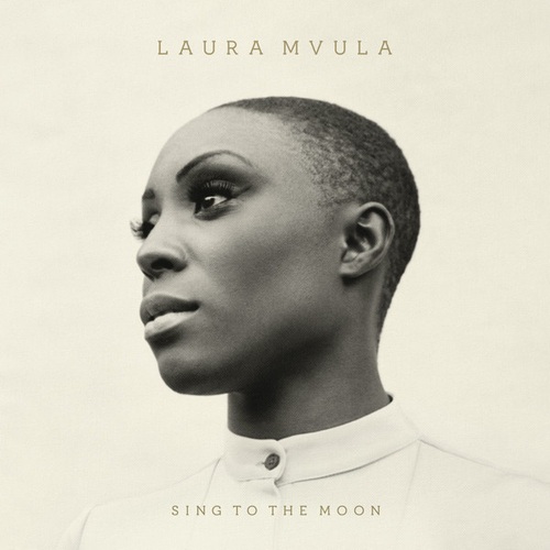
Sometimes you just can’t beat a well-taken portrait, and when you combine one with gorgeous tones, crisp lettering, an excellent collar and a textured finish, this is the result. A timeless-looking cover, that befits an beautifully constructed album.
Oneohtrix Point Never – R Plus Seven
This beautifully composed image is actually taken from
this Georges Shwizgebel animation, reproduced with permission. Both the cover and the film it comes from suit Daniel Lopatin’s album perfectly: playful yet strange, immersive yet unnerving.
Scott & Charlene’s Wedding – Any Port in a Storm 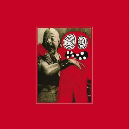
As we discovered when he
dropped into our studio to bastardise some weird old vinyl we’d picked up in his distinctive style, Craig Dermody is a man with a real love for record sleeves. Or adulterating them at least. So it’s no surprise that he saved some of his best work, featuring one of his favourite, freaked out characters, for his own band’s album.
ERAAS – Initiation
Brooklyn duo ERAAS are a dark yet groovy kind of band, and this is a dark yet groovy cover. The vivid red hue has a real glow against the black backdrop, giving some beautiful definition on the illustrations (even if we’re not sure what the hell they actually are).
Kurt Vile – Wakin On A Pretty Daze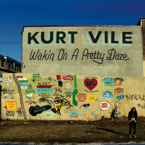
Kurt Vile collaborated with artist and fellow Philadelphian Stephen Powers for this cover, which features the Vile’s lyrics represented in Powers’ trademark graffiti style. While Vile looks slightly gawky and uncomfortable hunched over in the bottom right corner, his presence does lend a sense of the sheer scale of the mural (Powers had to use a crane to create the it, as you can discover for yourself in the short documentary below).
DJ Rashad – Double Cup
Footwork is a dense, high-speed and sometimes overwhelming genre that originates from the dense, high-speed and sometimes overwhelming city of Chicago. Thus, using the city’s urban landscape to visually represent DJ Rashad’s music is a no brainer, and doing it with this superb aerial shot is such a masterstroke that we’re prepared to overlook the cheesy typeface in the top left.
Endless Boogie – Long Island
From visions of modern realism to visions of bucolic mysticism. This gigantic woodland gent conjures thoughts of green men and mountain ghosts, of ancient myths and spirit realms. But mainly it conjures the thought: I really want to fucking listen to that album.
Kier Wiater Carnihan


Follow us
Follow us on Facebook Follow us on Twitter Follow us on Google+ Subscribe our newsletter Add us to your feeds